Key Takeaways
- Candlestick charts are the most popular type for cryptocurrencies due to the insight they provide into price action and sentiment.
- Support and resistance levels, trends, volume analysis and common patterns like triangles and flags are fundamental concepts.
- Moving averages and oscillators are useful indicators to generate signals and gauge momentum/oversold conditions.
- Analyzing multiple time frames provides a complete picture of both short-term moves and long-term market structure.
- With regular practice, technical analysis of charts can become a powerful tool for making informed trading decisions.
Cryptocurrency charts provide a wealth of information to analyze market trends and trader sentiment over time. Each data point shows the price movements throughout each period, whether that be hourly, daily or weekly. For traders, being able to interpret charts is essential to formulating an edge.
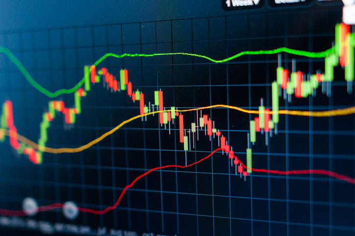
Candlestick charts are the most commonly used chart type for cryptocurrencies. Each candle, or candlestick as they are called, represents a single period of time, with the body showing the range between the open and close prices for that period. The upper wick shows the highest price reached, while the lower wick marks the lowest price. By analyzing the color, size and placement of candles, traders can gain insight into market psychology and momentum.
Green or white candles indicate the close was higher than the open, representing a period where buyers dominated. These candles confirm an uptrend is still intact if they get larger over time. Red or black candles show the close was below the open, signifying sellers drove the price down during that period. Consecutive red candles suggest downward pressure is increasing. Doji candlestick and spinning top candles, where the open and close are nearly equal, represent indecision in the market. These types of candles often form at peaks or troughs and can foreshadow a coming reversal.
Line charts provide a simpler view of trends by connecting the closing price of each period with a straight line. They are useful for identifying general uptrends and downtrends over longer time frames more easily than candlesticks. However, they lack the detail around intra-period price action that candlesticks provide. Still, many traders find line charts easier to interpret at a glance compared to candlestick charts.
Bar charts function very similarly to candlestick charts but instead of wicks, they only display the open, high, low and closing price vertically for each period. This removes some of the nuance provided by candlestick shadows but still conveys the overall price action that occurred. Bar charts take up less space than candlesticks when viewing multiple time frames simultaneously.
Key Areas to Analyze in Depth
Support and resistance levels are price thresholds that have proven significant in the past based on reaction or stalling of the market around those price points. Identifying important support and resistance levels allows traders to anticipate potential reversals or breakouts. When support holds during a dip, it signals buyers are active and the uptrend is likely intact. Similarly, if resistance prevents further upside, it implies increased selling pressure. Breakouts above resistance or below support often lead to meaningful trend continuation.
Volume adds context to the price action. Spikes in volume on large green or red candles validate the strength of the move. Low volume bumps or retracements against the trend often lack follow through. Traders pay close attention to volume profiles during breakouts and breakdowns to gauge commitment. Volume precedes price, so divergences where volume and price action differ can foreshadow reversals.
Traders analyze charts on different time frames to gain varying perspectives on trends and market structure. Higher time frames like the daily and 4-hour charts provide a bird’s eye view of the overall trend and key support/resistance zones. Lower time frames like the 15-minute and hourly add granularity around intraday price swings and consolidation patterns. It’s important for traders to be aware of how different time frames complement each other to form a complete picture.
Common Patterns in Depth
Trendlines are one of the most fundamental tools to identify trends. Upward and downward sloping trendlines connect at least two significant swing highs or lows on a chart. Touching the trendline repeatedly confirms its validity, while breaks above or below signal a potential trend change. Channels are formed by parallel trendlines that expand the trading range and provide additional support and resistance levels.
After strong directional moves, prices often enter periods of sideways consolidation as the market digests gains or losses. Common consolidation patterns include symmetrical and ascending/descending triangles formed by converging trendlines. Traders watch for breakouts above or below the pattern that confirm the original trend’s continuation. Flags and pennants are short-term continuation patterns that form after brief pullbacks and precede additional trending moves in the same direction.
Breakouts are significant events that signal the end of a consolidation phase. Traders place buy stops above resistance breakouts or sell stops below support breakouts to catch the momentum of the move. However, not all breakouts succeed, so only entering if accompanied by increasing volume and follow through limits risks. False breakouts that reverse right away can also trap traders on the wrong side of the market.
Indicators in Depth
Moving averages (MAs) are among the most popular technical indicators. Short-term MAs like the 20-period EMA are used to identify current momentum, while longer MAs like the 50-period SMA focus more on defining the overall trend. Traders watch for golden crosses, when a short-term MA crosses above a long-term MA, and death crosses, the opposite crossover, to generate buy and sell signals respectively. MAs also provide dynamic support and resistance levels.
Oscillators measure momentum and overbought/oversold conditions. The Relative Strength Index (RSI) compares the average gains to losses over a given period and generates values from 0-100. Readings above 70 imply an asset is overbought and due for a pullback, while below 30 signals an oversold bounce may be on the horizon. The Stochastic oscillator measures momentum based on closing prices relative to the trading range. Divergences between price action and the Stochastic can foreshadow reversals.
Putting it All Together
To demonstrate how to apply the concepts covered, here are analyses of real cryptocurrency charts. For example, on the daily Bitcoin chart, we can see:
- Price found strong support at $30k, confirming it as a key level.
- The RSI entered oversold territory below 30, signaling buyers were ready to step in.
- A golden crossover of the 20-day MA above the 50-day MA generated a buy signal.
- The break above the $40k resistance level was confirmed by a large volume spike.
With regular practice of this process across different assets and time frames, traders can learn to recognize patterns as they form and make educated entries and exits based on technical factors. Over time, this systematic approach to chart analysis will help optimize trading results.
In conclusion, cryptocurrency charts provide a wealth of information if you know how to read them properly. This guide covered the essential components and concepts to focus on when analyzing charts, from candlestick patterns to indicators and common consolidation formations. With ongoing study and real-world application, technical analysis of charts can become a core competency for traders to enhance their strategies and profitability in the cryptocurrency markets.
FAQs
What is a cryptocurrency chart?
A cryptocurrency chart is a visual representation of historical price data for a cryptocurrency plotted over time. It shows values like the open, high, low and close prices to analyze trends and market behavior.
What do the lines on a chart mean?
On a line chart, the line simply connects closing prices over time to depict trends. Candlestick charts use lines called wicks to indicate the intra-period highs and lows, while the candle body shows the opening and closing prices.
How do I read candlestick charts?
Green/white candles mean the close was above the open, red/black the opposite. The wicks show intra-period range. Patterns like dojis indicate indecision. Together they provide insight into momentum and sentiment driving prices.
What moving average is best?
There is no single best moving average. Shorter periods like the 20-day EMA are best for momentum, while 50-100 day SMAs focus more on trends. Traders often use a combination like the 20/50 crossovers to generate signals.
How do I use Bollinger Bands?
Bollinger Bands place an upper and lower boundary around a moving average based on standard deviations. When price touches the bands, it signals overbought/oversold levels where bounces often occur. Traders watch for breaks of the bands to identify significant moves.